 Banko Stoyanov
By optimizing the pictures on your website, you are essentially boosting the loading speed of its web pages. Another benefit is that if the photos a well ranked in the “image search,” they will lead more visitors to your site.
The optimization is extremely important for sites where the number of images is significant these include online stores, blogs, and many others.
- Here is what picture optimization in WordPress is and why you need it
- Why do we need to optimize our photos?
- Desktop and mobile device loading speed
- What is the meaning of an optimized image?
- Its size should be adaptive for the different screens
- Its file size should be optimal (present image formats)
- How to optimize our pictures in WP?
- Conclusion
Why do we need to optimize our photos?
The main reasons are as follows:
-
Loading speed improvement
-
Better user experience
-
Higher SEO ranking
-
Increase in conversions
The most important is the first one because the rest of them are dependent on it. When a webpage has photos with big file sizes (for instance, over 200 kB each), they impact the loading speed significantly. On the other hand, the slow lading speed leads to worsening the user experience, as well as the search engine ranking. The faster the loading speed of a page, the better the user experience, therefore, it will appear higher in search results.
Here, you can see what else is impacted by the loading speed: Why is a website’s loading speed so important?
When it comes to loading speed, visitors from mobile devices are crucial. We all know that due to several reasons, the desktop version of every website loads faster than its mobile alternative. One of the reasons why this happens is the mobile data used by a huge part of users. Additionally, the hardware of some older devices might not be sufficient for a faster load.
It is not easy to imagine the difference between the loading speed of optimized and non-optimized images. That is why we have done some testing.
We compared the loading time of a web page with four images on both desktop and mobile devices. The first test was with non-optimized pictures, during the second one, they were optimized.
The file sizes of the images are as follows:
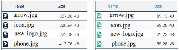
The total file size of the images has been reduced all the way from 1.75 MB (1024kB=1MB) to 210 kB.
Desktop and mobile device loading speed
We did several tests using various web tools such as PageSpeed Insights, WebPageTest, Pingdom, and BrowserStack. The performance in the different environments was different in terms of loading time, but the results were clear, there was a huge delay, the cause of which might be the non-optimized images.
We have decided to show you the results from BrowserStack’s SpeedLab for the sole reason that their arrangement is easy-to-understand. Also, the execution of the tests was done on real devices and browsers.
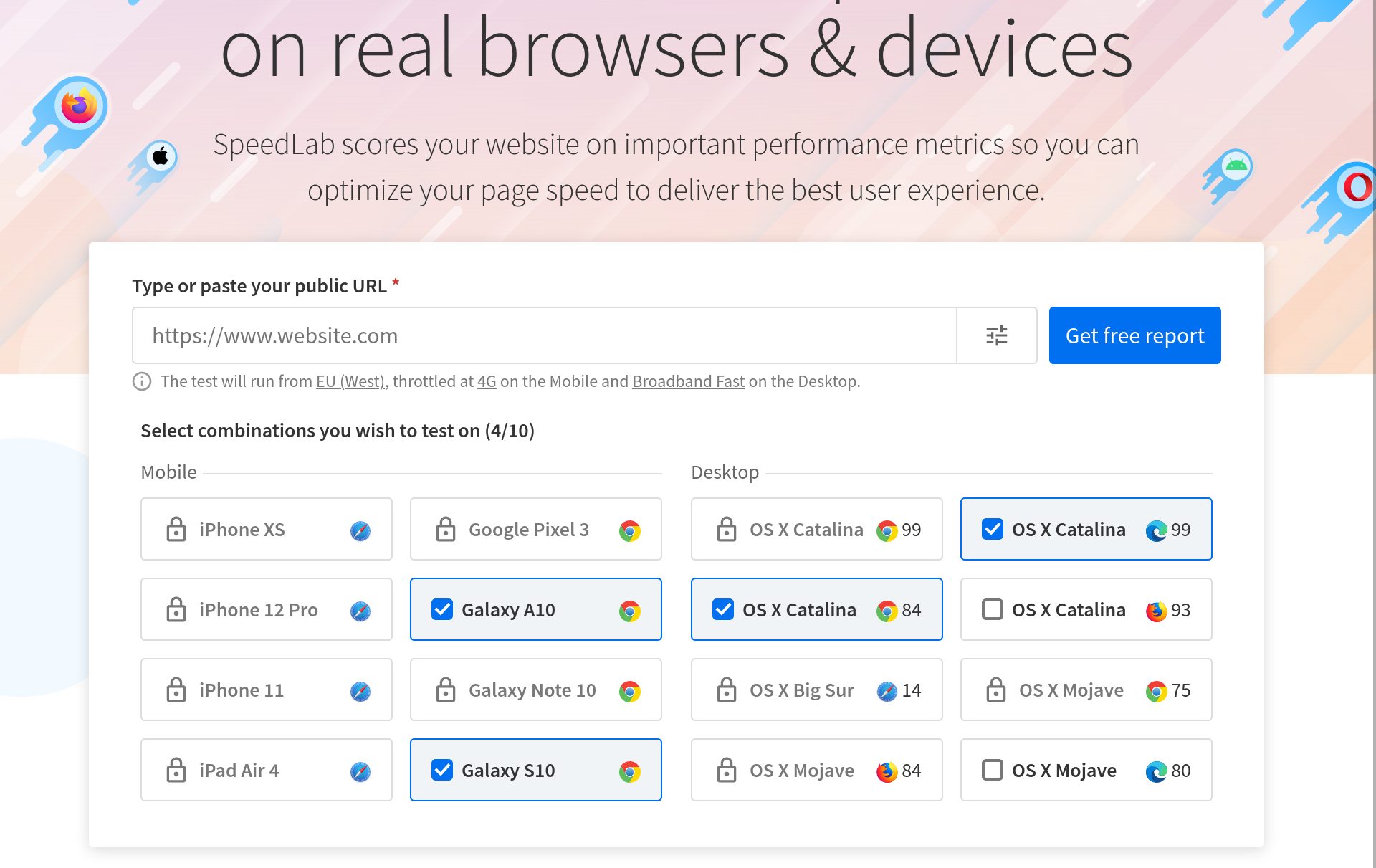
Non-optimized images
There is a huge difference between mobile and desktop loading speed. The web page takes almost twice as much time to load on the mobile device. That is the cause of the other indicators being twice as bad.
First contentful paint (FCP) – This metric measures how long it takes for the browser to display the first part of the content after the page query (from the DOM document tree).
Speed Index – This metric shows how fast the content on the page fills up during loading.
The decrease in the file size results in the page being almost twice as fast.
As you can see, according to BrowserStack, for a loading speed on a mobile device to be considered fast, it needs to be equal to or less than 3.30 seconds and up to 1.80 seconds for a desktop.
Whenever you are planning on optimizing your website, these values might serve you as goals that you need to reach and even surpass. However, optimizations are done simultaneously for mobile and desktop versions of the site. No matter what you do, optimizing your website for mobile devices will inevitably improve the loading speed for desktop versions.
As the tests show, larger images, in our case four with a total size of 1.75 MB, are causing a delay in mobile loading of almost 2 seconds (non-optimized 4.30seconds – optimized 2.60 seconds).
How would this two-second delay affect the page’s conversions?
What is the meaning of an optimized image?
Firstly, what are images? They are files, and as such, they have a size – kilobytes, megabytes. Also, they are graphic images, and as such, they have dimensions – width and height. No matter which one you reduce, you are applying image optimization.
Web images are not used for printing, and that’s why their dimensions (WxH) do not need to be larger than the page space in which it loads. Apart from that, the size of the image (MB) has a significant impact on the server’s download time. All recourses intended for the web (Which means all files) should not be huge, their size should not exceed kilobytes.
The larger the file, the longer it will take to download. If the file is a recourse of a web page, it may slow down the overall page loading.
Images are an important element of the design of a web page, not only that, but they are also a great addition to the understanding of the content. They should be visible as soon as the page loads. However, the download and the display of a two-MB picture can take a while, especially on a mobile device.
The solution for oversized images (WxH) is to generate suitable smaller alternatives that are downloaded according to the size of the display. That way, we avoid downloading large photos since they are displayed on a small screen.
The solution for files that are too large is to apply compression. The compression level and the image quality are dependent on the format of the file(jpg, png, webp, and others).
Its size should be adaptive for the different screens
Different devices (desktops, tablets, phones, etc.) have different display sizes and resolutions (pixels in width and height).
If we have an image on our site displayed across its entire width, we will upload it with a width of 1920px because we want it to be of the best quality and look good. All the rest of the devices will download the same picture and resize it accordingly to their screens.
Here lies the problem of choosing the proper size. It is always the easiest way to upload a large image that loads on all devices and resizes in the browser. Large files are problematic for mobile devices because they slow down the process of page loading.
Many websites have a limited layout in terms of width, most of the time set by their WordPress theme. Most of the time, it is around 1100-1200px. If the block (container) of the content in which the pictures are displayed has a maximum width of 1200px, uploading a photo with larger width makes no sense. For instance, if the site is loaded on a device with a higher resolution than 1200px, the container will remain 1200px. That’s because it has a set maximum width, which cannot be exceeded.
(The loading images’ dimensions are checked with the EWWW Image Optimizer plugin)
Despite reworking the images and uploading them with resolution up to 1200px, the problem with small screens remains. Mobile users will download the large image then the browser will resize it to about 500-300px in width.
For the mobile visitors not to download too large images, we can create multiple versions of the original picture – with different sizes, of course.
But, how to decide what dimensions and how many variants we need?
When developing the theme or designing a new website, it is advisable to check the most commonly used resolutions globally and locally – depending on the target audience.
In October 2021, the resolutions used the most in Bulgaria are:
-
Desktop: 1920 × 1080, 1366 × 768, 1536 × 864
-
Mobile device: 360 × 640, 360 × 780, 412 × 915
-
Tablet: 768 × 1024, 600 × 1024, 1280 × 800
If the site is already up and running, you can use a statistic tool such as Google Analytics to check which are the resolutions that people use the most.
Since creating a separate version of the image for every possible device is not practical, we can choose several sizes, which will be used by many devices close in resolution.
For instance, according to Microsoft’s design system, every image can have three versions:
-
Small (less than 640px)
-
Medium (641px to 1007px)
-
Large (1008px and larger)
Each image will serve a specific group of devices close in screen size. The place where you will switch to the appropriate option is called the “breakpoint.”
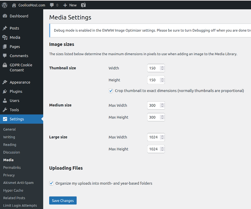
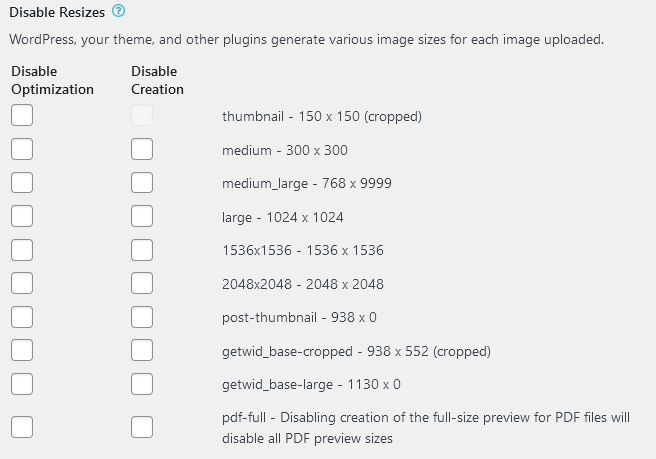
WordPress has a built-in feature for creating additional image versions. Its settings are in Settings »Media.
In general, the WP theme uses its functionality to set its image versions.
(You can see all the generated versions with the EWWW Image Optimizer »Settings» EWWW Image Optimizer »Enable Ludicrous Mode, Resize tab plugin)
If you need to manually generate the variants, you can utilize a web tool like https://www.responsivebreakpoints.com/. Not only does it create the image versions, but it also provides you with the special code (HTML5 picture tag example), which every image must have.
And here we are, to the answer to the question – since we have several image versions, how does the browser decide which one to download?
The answer is simple, with a special code added to the image’s img tag. The code describes all available options, from which the browser chooses which to load.
WordPress also has a built-in feature that describes all generated versions of the original image with the srcset and sizes attributes in the image’s “img />” tag.
<img src=”image.jpg” alt=”image” srcset=”image-320.jpg 320w, image-640.jpg 640w” sizes=”(max-width: 900px) 45vw, 300px” />
Its file size should be optimal (present image formats)
The size of the file is entirely dependent on the format under which we have saved it. Some of the most popular image formats on the web are PNG, JPG, SVG, and GIF.
Different image formats offer different levels of compression. The goal of file compression is to reduce the size of the file while maintaining the quality of the photo. When there is no impact on the image quality, we call it lossless compression. The opposite of it is a lossy compression, where the quality of the picture worsens. The JPG format is the perfect example of damaging the image quality during compression.
However, in the ranking of formats, a not-so-new format (WebP) is steadily rising. After it, we can see another brand new in the name of AVIF.
AVIF is still not as used, but it is mostly utilized by high-traffic websites such as Netflix.
However, both formats appear in the recommended section of several website testing tools such as Speeds Insights.
WebP
WebP is an image format developed by Google. Images have a smaller file size – over 25% compared to other formats such as JPG and PNG.
-
Up to 34% smaller file than JPG, up to 26% smaller than PNG
-
Supports animations and transparency
-
Developed by Google
-
First version – September 2010
-
Supported by 95% of browsers (around November 2021)
-
Supported in WP from version 5.9
The new version of WebP 2 is under development. Its main goal is to achieve the AVIF’s level of compression.
A web tool with which you can convert images to WebP format is Squoosh.
We have listed several plugins, which you can utilize to optimize and convert images into WebP format, they are as follows: EWWW Image Optimizer, Imagify (requires an account at imagify.io), Optimole (requires an account at optimole.com).
You can also read more about the plugin here: EWWW Image Optimizer – Optimization of images in WP.
AVIF
AVIF is a fairly new image format based on the AV1 video format. Its first version was released in February 2019. This format outperforms every other one when it comes to compressions (JPG, PNG, and even WebP). It can be used in images as well as image sequences.
- Up to 50% smaller file than JPG
- Supports HDR and transparency
- Offers the highest level of lossless and lossy compression
- Developed by AOMedia (Alliance for Open Media)
- First version – February 2019
- It is supported by 69% of browsers – Firefox, Chrome, Opera, Opera Mobile, Android, Chrome (Android)
It is also supported in the new version of Android 12, released in October 2021. For now, it will not be the default format for photos taken with the phone’s camera.
Web tools that can convert images to AVIF format: avif.io, Squoosh.
We have mentioned some WP plugins which you can use to optimize and convert images to AVIF format, they are as follows: ImageEngine Optimizer CDN (paid license).
How to optimize our images in WordPress?
You can optimize your images either manually or via a plugin.
Manual optimization is more useful for images that we have not uploaded to the site yet. For instance, If we want to reduce dimensions and file sizes with the help of an image processing tool like PhotoShop or a web app such as iLoveIMG (this one is in Bulgarian), as well as Squoosh.
The faster way of optimizing pictures is via an automated plugin. It can be applied to already uploaded images, as well as when uploading new ones in WP. For example, when you are uploading an image, you reduce the photo’s resolution to set parameters (1024px, for example), and you can convert it to a specific format like WebP, for instance.
WordPress has a huge library of plugins, such as reSmush, Imagify, Optimole, ShortPixel, and EWWW Image Optimizer.
If you want to use Imagify, Optimole, or ShortPixel, you will have to register on the relevant website.
When it comes to choosing between reSmush and EWWW Image Optimizer, we chose the second option because it gives us a wider variety of settings and options.
With EWWW Image Optimizer, you can optimize already uploaded images, as well as when uploading new ones, to apply optimizations such as:
-
WebP conversion
-
Resize to maximum dimensions which were predefined in the settings
-
Size optimization, removal of redundant information from the image file (EXIF, comments, etc.)
You can read more about the plugin here: EWWW Image Optimizer – Image optimization in WordPress
Conclusion
The image optimization on a website is necessary because its pages start loading slower when the photos are too large (both in size and in kilobytes). Particularly sensitive to the size of the images are mobile visitors who load the site via mobile data. The larger the pictures, the slower the page’s loading speed.
Currently, the trend is to switch to the WebP image format, which allows good image quality, but with much smaller file size (compared to the familiar PNG, JPG). WordPress supports WebP images you can upload such through the library or directly in the block editor. Some plugins can convert already uploaded images to WebP format.
Looking to the future, we see a promising new image format – AVIF, which is defined as a substitute for JPG and PNG formats. Currently, it is supported in almost 70% of browsers, but WordPress has not yet added support.